10
Nov
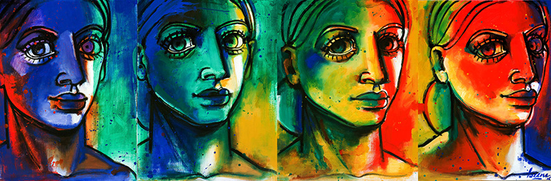
Transparent colors
0 Comments
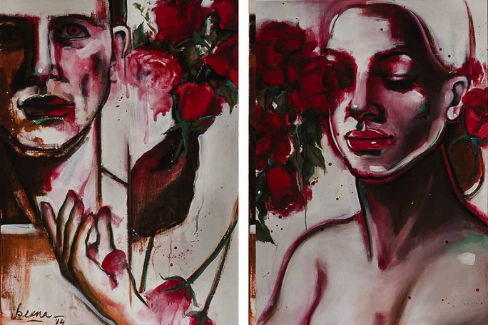
Remembering red -The roses of love
Acrylic on canvas 24" x 34" x 2
Crimson red is one of the most challenging colors to work with and one of my favourites too. While using crimson one cannot afford to make any errors , no overworking the color - infact one has to get it right the first time around. This is so because if you add a second layer the color loses its transparency and looks dull and if you correct it with white, it turns pink losing the very subject of the painting - Red Roses.
This painting was done while remembering my first painting in the series of red roses that was sold and was sorely miseed by everyone in the family. I did this one as a diptych as I wanted a disrupted flow of crimson with a juxtaposition of the male/female hands and body, and have used minimal color on white to bring out the freshness of the roses.
Comments
No comments found!